
ARVOT
Academic Evaluation Project
Logo
Project Overview
ARVOT (Arvioinnilla oppimisen taitajaksi, roughly meaning “Assessment as a Learning Tool”) was a two-year development project (2017–2018) funded by the Finnish National Agency for Education. Its goal was to enhance the use of assessment as a learning process in primary schools. Coordinated by the Oulu Teacher Training School in collaboration with the Joensuu Teacher Training School, the project focused on innovative approaches to assessment during learning.
Services Involved
Lasse Eronen
Education Entrepreneur & Scholar
University of Eastern Finland
I have collaborated with Eero since 2014 on multiple projects. He has proven to be an exceptionally creative and visionary thinker, both in graphic and musical solutions. At the same time, he is highly committed to logic and functionality, which has elevated our project execution to an excellent level.
Solutions created by Eero have always been delivered on time, and he has been highly attentive to the client’s needs. He’s an extremely reliable collaborator, and his contributions have been invaluable.
Jaakko Väisänen
Project Coordinator & Scholar
University of Eastern Finland Teacher Training Unit
As a graphic designer, Eero is not only an artist but also a top professional in business and communication. That’s why I give him 5/5 stars!
Eero’s strengths:
Visual talent and technical skills
Creativity and innovativeness
Communication and collaboration skills
Ability to adapt to changes
Consistency and professionalism
My Role & Contributions
For the ARVOT project, I designed a logo inspired by Reflection Landscape (Arviointimaa), which served as the project’s visual foundation. The logo represents an imaginary world where selected skills are reflected upon as a symbol pin moves across a map.
To ensure adaptability for different media and publication types, I created three variations of the logo – color, black, and white – and versions in both Finnish and English, with a bit different ideas behind each.
Modern, Clear, and Imaginative
At the heart of the Finnish ARVOT logo is an element shaped like the letter V, resembling a “map pin” piece for Reflection Landscape, which is attached to a map plane placed beneath the ARVOT text. The plane is elevated a bit above the table, with one edge slightly higher than the other, symbolizing dynamism and innovation.
The map pin symbol – a seven-pointed star or sun – represents broad and comprehensive evaluation. Due to its common shape, it also leaves room for the viewer’s imagination. The logo is simple and monochromatic.
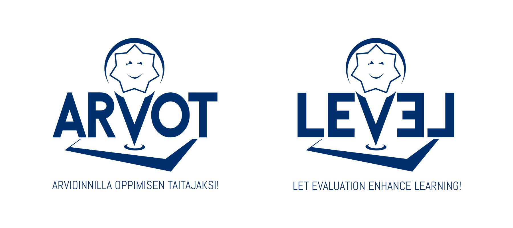
In the English version, LEVEL (meaning “level, aligned, stage of development, to balance”) – as in Let Evaluation Enhance Learning! – the acronym itself verbally supports the purpose and goals of the ARVOT project in multiple ways. The symmetrically mirrored EL letters on top of the level illustrate how the same outcome can be reached through different paths and justifications.
The logo itself is based on a custom-designed font, whereas the slogan (Arvioinnilla oppimisen taitajaksi! / Let Evaluation Enhance Learning!) is written in the Abel font.
For consistency, the Abel font should be used as the official font of the ARVOT project. When that’s not possible, Avenir or Arial are suitable alternatives.
The original dark blue version is to be used in colored documents with a white background.
© Eero Karvonen
Black for Simple, Clean Designs
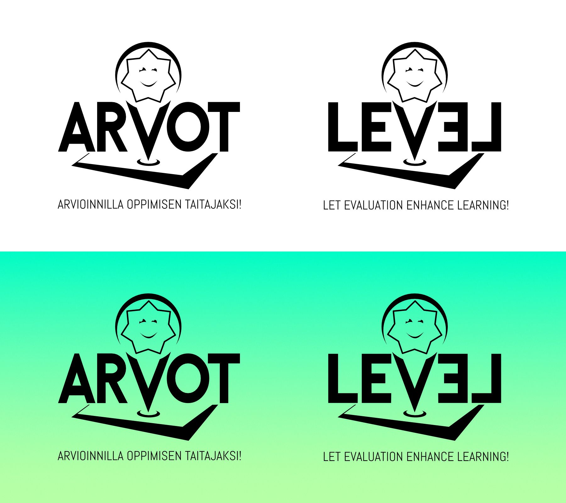
The black logo may be used against a white or colored background, provided that it remains clearly distinguishable with all its details.
© Eero Karvonen
Inverted for Dark Backgrounds
The white logo is always used against a black or dark background. Unlike the dark version, the color-inverted version gives the impression that light is shining from beneath Reflection Landscape, giving the entire logo a sense of “lift” or elevation.
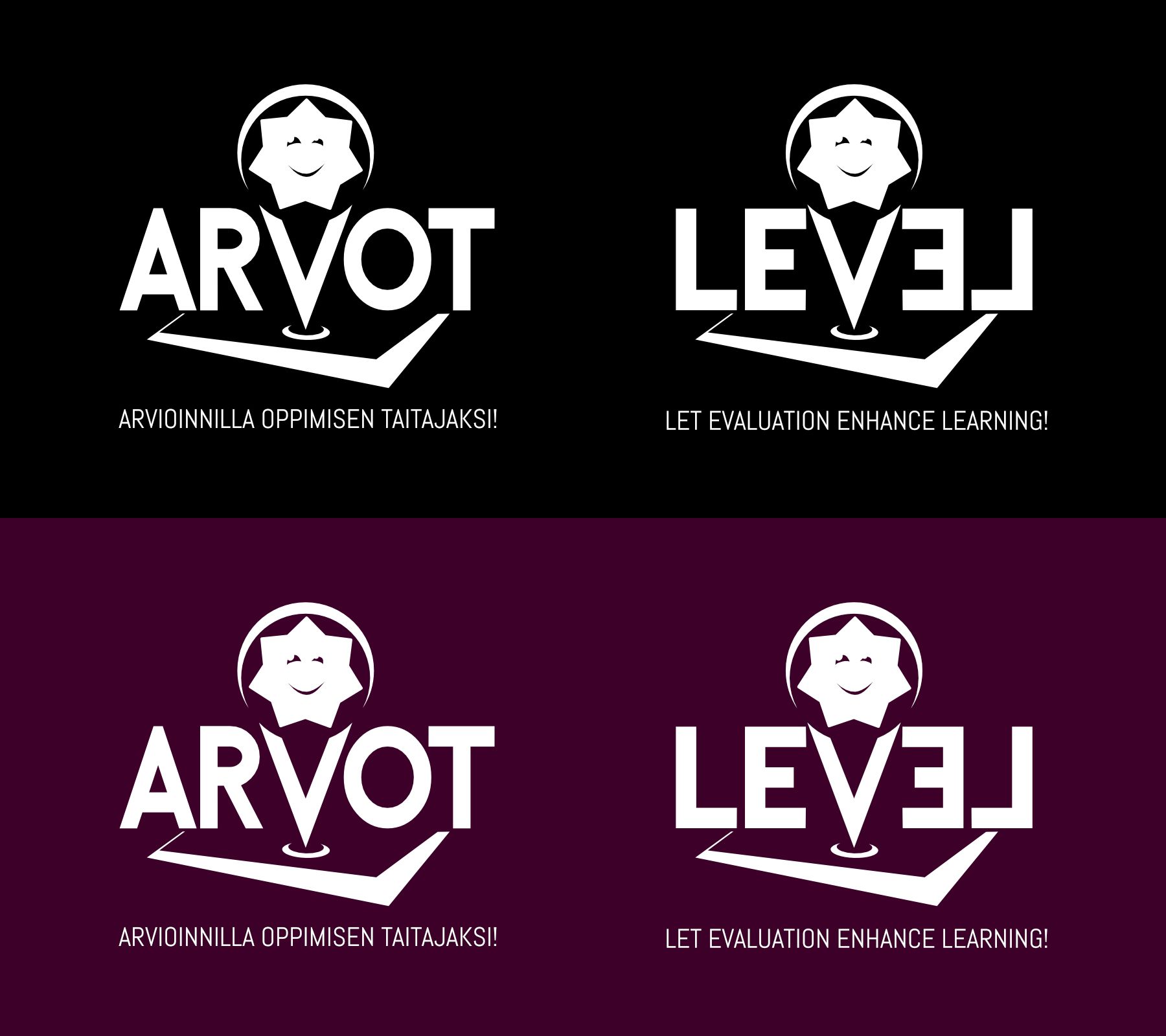
© Eero Karvonen
See the logo in the academic publication below.

More Projects Related to the University of Eastern Finland